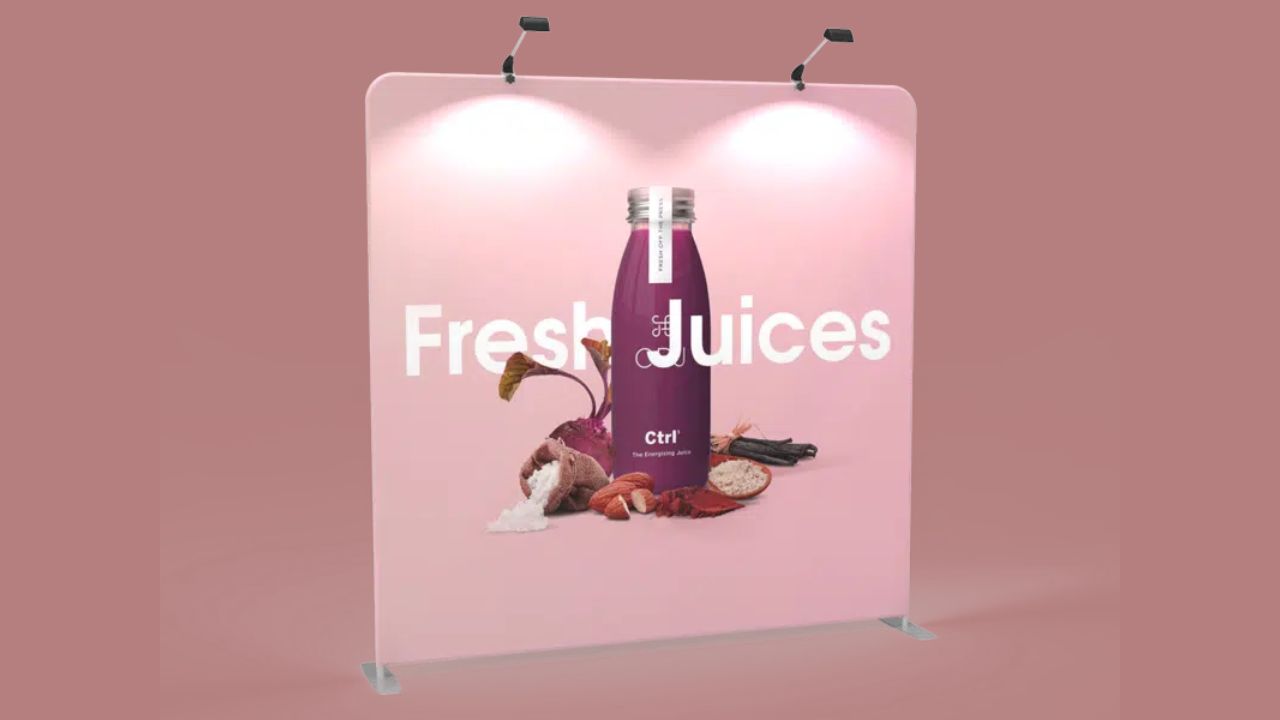
Fabric banners are now being used as one of the most successful marketing tools for trade shows, exhibitions, retail promotions, and events. Lightweight design, reproduction color, and not having wrinkles make them a better alternative to the conventional vinyl or PVC banners. But the finest printing can never be used to make up for bad taste in design. Even a tension fabric banner printing will lose all its effect in case the artwork is cluttered, misaligned, or is not well optimized for printing on large-format. It is crucial to comprehend and prevent most of the design errors.
Poor Font Choices and Inconsistent Typography
Typography is central in conveying brand name and legibility. One of the errors that is often made when designing the banner is the use of too many font styles or the fonts chosen are too narrow, too ornamental, or too small. The fonts should be bold, simple, and readable since banners are supposed to be looked at from far away.
The designer can at times select classy script fonts which can appear fine on near view but cannot be read easily when printed on a huge banner. The other common mistake is the uneven typography – use of fonts, font sizes, or font colors without a clear hierarchy. It is misleading and gets to the point. A design that is focused on one or two matching fonts and has consistent spacing and alignment should be used to get professional results.
Ignoring Color Contrast and Lighting Conditions
Colors are very strong in attracting attention, and even the best design becomes useless in case of poor contrast between the background and the text. Mist colored reading on white or a light background, e.g., may be rendered invisible at a distance. Likewise, the dark colors, printed on dark colors, may seem dark and unclear.
The other factor that is usually ignored is the effect of lighting conditions on the perception of color. Backlit cloth shows, such as can cause some colors to really appear brighter or more transparent than anticipated. The environment in which the banner is going to be displayed (indoor artificial lighting or 12 months of cloudy weather outdoor natural lighting) is one of the things that the designer should consider, and also samples of colors should be tested out before the final print is made.
Ignoring Bleed and Safe Area Requirements
There are specifications in layout that must be paid close attention to during fabric banner printing, like bleed and safe areas. Designers new to large-format printing forget to leave the design past the trim line or put essential elements out of the corners. It may lead to the fact that something important is cut during the final work, such as text or logos.
The bleed margin is to guarantee that the design is just a little bigger than the finished cut size to ensure that the design is not overrun by unwanted white margins. The safe area maintains important contents such as text and logos in a safe area. Violation of these printing rules will result in expensive reprints and a final product that may not be professional. It is always prudent to thoroughly abide by the instructions the printer provides in the artwork setup before placing files.
Neglecting Brand Consistency
An attractively printed banner is still a failure when it is not in line with the general visual identity of the brand. Cases of inconsistent application of logos, colors, or design in the context of customers can be confusing and decrease brand recognition. All the banners must be integrated into the overall marketing plan of the brand and have the same tone, color scheme, and style as employed in the online and print media.
Designers ought to make sure that brand guidelines are adhered to and that contact information, the logo, and tagline are correct before printing. The recognition that is made coherent helps to build on brand perception and transmit professionalism and reliability.
Conclusion
The printing on fabric banners provides an inexhaustible opportunity to create something creative; however, success cannot be achieved without careful and accurate design. There can be overcrowding, low-resolution imagery, bad font selections, and poor contrast of colors, which can all reduce the visual impact of otherwise high-quality print. The focus on such technical features as bleed areas, resolution, and lighting conditions guarantees the perfect outcome. But most importantly, a banner will be made aesthetically pleasing and will assist in achieving its objective because of the uniform branding and articulate communication. Banner printing on a piece of cloth, when done in the right way, can transform a simple display into a successful branding tool that will make heads turn and look professional whenever a given event is going on.

